
System Architecture Overview
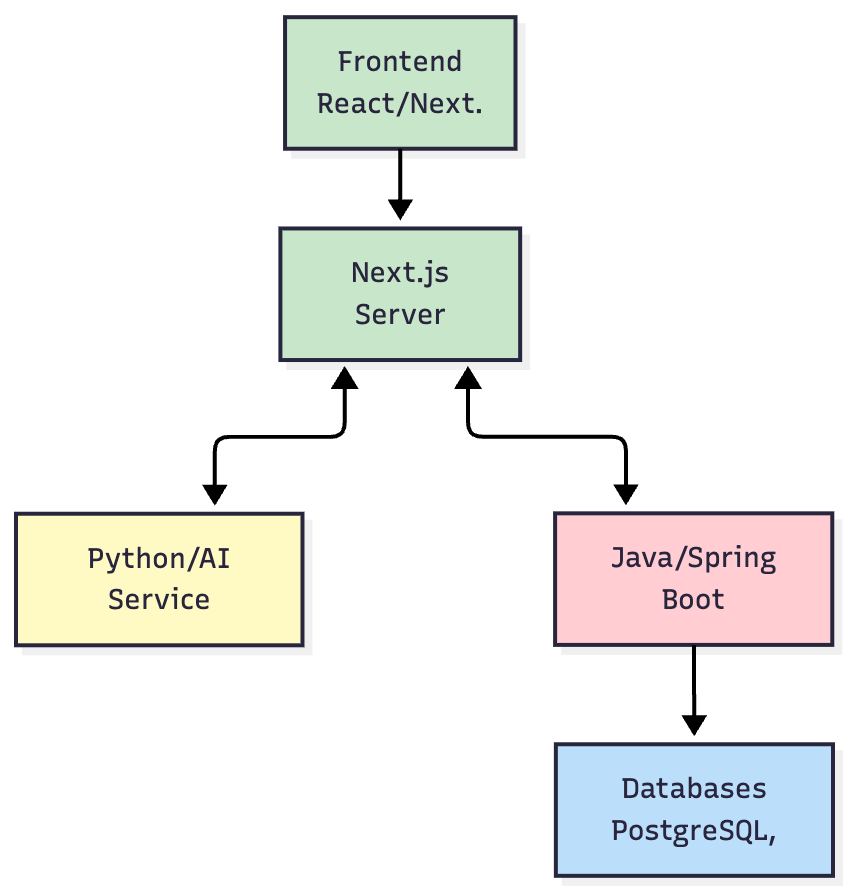
- Frontend (Next.js): A highly interactive client application responsible for all rendering and user interaction.
- Next.js Server (BFF): Acts as a Backend-for-Frontend, aggregating data from downstream services and server-rendering pages for optimal performance.
- Python/AI Service: All AI-related logic is isolated here. This allows us to leverage Python's rich AI/ML ecosystem (like LangChain) and scale the AI workload independently from the core application logic.
- Java/Spring Boot Core Services: The workhorse of the platform, handling core business logic, user management, permissions, and orchestrating data queries. Its robustness and strong typing make it ideal for these critical tasks.
Performance & Scalability by Design
Data Points per Chart | Avg. Render Time (ms) | P95 Render Time (ms) |
|---|---|---|
| 10,000 | 120ms | 180ms |
| 50,000 | 450ms | 600ms |
| 100,000 | 980ms | 1300ms |
- Stateless Services: All backend services (Java and Python) were designed to be stateless, allowing us to scale them horizontally by simply adding more container instances.
- Asynchronous Job Processing: For long-running queries or data refreshes, we used a message queue and background workers to process these jobs asynchronously, preventing the main application threads from being blocked.
- Containerization: The entire system was containerized using Docker and orchestrated with Kubernetes (via GKE), enabling automated scaling and deployment.
Technical Deep Dives: Engineering Complex Features
1. Deep Dive: Secure Custom SQL for BI Workbooks
- Security (SQL Injection Prevention): Instead of executing raw SQL, we parsed the user's query into an Abstract Syntax Tree (AST). We then validated the AST against a strict allow-list of SQL commands (e.g., SELECT, JOIN, GROUP BY) and functions. Any disallowed operations (e.g., DROP, UPDATE) would invalidate the query, completely eliminating injection risks.
- Performance (Preventing Runaway Queries):
- Resource Sandboxing: Queries were executed in a sandboxed environment with limited CPU and memory.
- Automatic LIMIT: We automatically appended a LIMIT 10000 clause to all user-written queries to prevent accidental full table scans.
- Query Timeouts: A hard timeout (e.g., 60 seconds) was enforced at the execution layer. Any query exceeding this limit was automatically killed.
2. Deep Dive: Architecting Drill-Down Journeys
- Data Structure: The journey paths were defined in a JSON configuration stored in our metadata database. This structure defined the sequence of drill-down steps, the columns to be used, and the desired chart type for each step.
- State Management: As a user drilled down, the state of their journey (current step, applied filters) was managed on the frontend using React's Context API. This context was passed with each subsequent query to the backend, which would then return the data for the next "draft" widget in the predefined path.
3. Deep Dive: The Real-Time Alerting System
- Scheduler: A cron-based scheduler service was built to trigger alert checks at user-defined intervals (e.g., every hour, every day at 9 AM).
- Condition Evaluation Engine: When a job was triggered, the engine would execute the associated query. It would then compare the result against the alert's condition (e.g., value > 1000).
- Notification Pipeline: If the condition was met, a notification event was published to a message queue. Separate consumer services would then deliver the notifications through different channels (e.g., email, UI notifications, webhooks), making the system easily extensible.
Core Features: From Problem to Solution
1. Interactive Dashboards & Real-Time Visualization
2. Advanced Data Visualization Suite
- Foundational Charts: Highly configurable Bar, Line, Area, Pie, and Donut charts.
- Specialized Visualizations: Advanced widgets including KPIs with period comparison, Scatter Plots, Packed Bubble Charts, Funnel Charts, and Tree Maps.
- Data-Intensive Tables: Powerful Tables and Pivot Tables with an innovative Tree View option, allowing users to dynamically summarize and explore hierarchical data.